
Visual merchandising is not about aesthetics alone. It is a revenue driver, and when it underperforms, the financial consequences are significant.
According to GlobalData, poor in-store execution costs U.S. retailers approximately $125 billion each year, representing more than 3 percent of total brick-and-mortar retail sales. These losses are driven by issues such as cluttered displays, poor product visibility, and confusing store layouts. Mid-market retailers are particularly affected, accounting for an estimated $54.1 billion in lost revenue annually.
What is often overlooked is how directly visual merchandising influences shopper behavior. Effective merchandising controls how customers navigate a space, what captures their attention first, and how quickly they move toward a purchase decision. When executed correctly, it increases dwell time, drives impulse purchases, which represent roughly 20 to 40 percent of sales in well-merchandised environments, and creates a cohesive brand experience that encourages repeat visits. When executed poorly, the impact is immediate: nearly half of consumers abandon their carts and leave the store altogether.
FELBRO Studios has been designing and manufacturing custom POP displays, retail fixtures, and branded environments since 1945. Headquartered in Los Angeles, we partner with national retailers and CPG brands to deliver scalable visual merchandising programs that guide shopper behavior, support long-term rollouts, and drive measurable retail performance, not just visual appeal.
This article outlines 10 common visual merchandising mistakes that quietly erode sales across apparel, beauty, electronics, grocery, and specialty retail. Whether you oversee a single location or manage a large-scale retail program, understanding these pitfalls is essential to protecting revenue and maximizing in-store performance.
Ready to take a closer look at your current in-store experience? Contact FELBRO Studios at 925-586-6244 to schedule a consultation.
👉Also Read: Top Luxury Retail Display Ideas to Boost Winter and January Sales
Mistake 1 – Cluttered or Overcrowded Displays

Imagine a 1,500 square foot boutique that doubles product density on display tables during a seasonal sale. The assumption is familiar: more products on the floor should translate into more sales. In practice, the opposite often occurs. Conversion drops as shoppers feel overwhelmed, disengage, and leave without purchasing.
Overcrowding works against how customers visually process information. When too many elements compete for attention, the brain struggles to prioritize what matters.
Research by PathIntelligence found that a 1% increase in dwell time resulted in a 1.3% increase in sales (McAdams & Biggar, 2007), demonstrating that even small increases in engagement time at displays directly impact purchasing decisions.
The outcomes are both measurable and documented:
- 73.4% of consumers report dissatisfaction with current visual merchandising standards
- 10.6% of shoppers cite confusing store layouts as a top merchandising frustration
- 49% of consumers left a store without making a purchase due to poor visual merchandising
- 66% of consumers with families (those with a child under 18 living at home) left a store due to poor merchandising
The “less is more” principle is supported by data. Overstocking fixtures communicates a lower price tag—the more negative space allowed, the higher-valued the perception. Curated assortments presented with strategic use of negative space consistently outperform the “everything everywhere” approach commonly seen in price-driven retail environments. Clear hierarchy builds confidence, and confidence drives conversion.
FELBRO Studios designs modular display systems that intentionally apply visual hierarchy principles, including balanced proportions and controlled negative space. Many of our programs incorporate strategic use of negative space to improve readability and guide shopper flow. In one tiered endcap program developed for a national beverage brand, clear sightlines, limited SKUs, and focused messaging contributed to a documented 15 to 25 percent lift in unit sales.
Practical tips to declutter:
| Action | Impact |
|---|---|
| Maintain white space around hero products | Draws attention to key products |
| Limit SKUs to 3–5 per shelf level | Reduces decision fatigue |
| Remove damaged or outdated stock from prime displays | Protects brand perception |
| Use adjustable fixtures like slatwalls and risers | Enables flexible merchandising |
👉Also Read: How to Build a Successful Shop-in-Shop: Complete Guide from LA’s Leading Luxury Retail Display Manufacturers
Mistake 2 – Poorly Defined Focal Points
A focal point is the visual anchor that captures attention first when a shopper enters an aisle, rounds a corner, or approaches a wall bay. When focal points are poorly defined or absent altogether, displays blur into visual noise, and priority products or promotions fail to register.
Eye-tracking and shopper behavior studies consistently show that attention is not distributed evenly across a display. Research by Sorensen found that 80 percent of shoppers’ in-store time is spent navigating, and the remaining 20 percent is spent deciding which items to purchase, demonstrating how critical it is to capture attention during those decision-making moments. The primary “bullseye” area at eye level, generally between 4 and 5 feet from the floor, commands the most attention.
One study found that eye-level merchandise received 35 percent more attention than products on lower shelves. Research shows that 50% of consumers buy on impulse because of attractive displays, underscoring the importance of clear visual hierarchy in driving unplanned purchases.
Effective visual hierarchy relies on four core mechanisms:
- Scale – Larger elements naturally command attention before smaller ones
- Contrast – Strong contrast separates priority products from the background
- Color – Intentional color use creates visual pathways and cues movement
- Lighting – For retail hangers and table displays, 3000K lighting is preferred, and research indicates that proper lighting can improve product visibility by 30% to 50%
To see this in practice, consider a cosmetics gondola where a hero product is positioned at eye level, illuminated more prominently than surrounding SKUs, and supported by a clear “New This Season” header. The shopper’s gaze is guided first to the hero item, then to complementary products, and finally to pricing or promotional messaging. This is not accidental. It is a deliberate visual structure shaping buying behavior.
At FELBRO Studios, our design process typically starts with defining 1-2 focal points per display. Every element—directional signs, lighting placement, larger product facings—supports that hierarchy rather than competing with it. This visual merchandising display approach has helped clients achieve 35% lifts on seasonal promotions simply by isolating hero products within endcap displays.
👉Also Read: From Concept to Retail Floor in Los Angeles: How Retail Display Prototyping Brings Brand Vision to Life
Mistake 3 – Ignoring the Customer Journey
Every retail store develops a default traffic pattern based on layout, entrance position, and cultural norms. In many North American stores, shoppers tend to turn right upon entering, which makes the right-hand side and front-right zone particularly valuable for merchandising. This is not random behavior; it is predictable enough that strong retail merchandising strategies are deliberately designed around it.
Customer journey stages
Understanding the in-store customer journey means mapping four key stages:
- Entry – The first impression, often formed within just a few seconds of stepping inside.
- Exploration – Browsing main aisles, power aisles, and department zones.
- Decision – Engaging with specific fixtures, tables, or racks where product choices are made.
- Checkout – Final add-ons, last-minute purchases, and impulse decisions near the point of sale.
Framing your retail store layout and display strategy around these stages helps ensure that key stories and products appear where shoppers are most receptive.
Traffic flow and storytelling
In many stores, traffic tends to follow recognizable loops or “racetracks” from entrance to checkout rather than moving randomly. When displays or fixtures block this natural flow, shoppers are more likely to feel crowded or frustrated, which can increase abandonment of aisles or sections. By contrast, when a cohesive story unfolds along the natural path, for example, a spring apparel story that starts in the window or front zone, continues on a front table, and finishes with accessories near fitting rooms, shoppers are encouraged to continue exploring and spend more time with the assortment.
Because exact percentages (such as “70% follow a figure‑8” or “abandonment spikes to 50%”) are not consistent across store formats, it is better to talk about these effects directionally unless you are referencing your own measured data.
Measuring real customer behavior
The key is to measure actual customer behavior in your own store rather than relying on assumptions or generic rules. Practical visual merchandising techniques include:
- Reviewing security footage to identify dominant traffic paths, pause points, and ignored zones.
- Using in-store sensors (such as Bluetooth beacons, Wi‑Fi analytics, or vision-based systems) to track dwell time and pathing; longer dwell in high‑value zones is a useful benchmark, but “ideal” times vary by category.
- Installing traffic counters at key entrances, power aisle intersections, and promotional zones to quantify flow and identify dead spots that may need layout changes or stronger displays.
Practical placement tips
To translate insights into layout decisions:
- Position discovery and feature displays at natural “pause points,” such as the ends of power aisles or just inside the decompression zone.
- Avoid creating blockages or bottlenecks in narrow aisles or chokepoints where foot traffic concentrates.
- Place impulse or add‑on items at decision points where shoppers naturally slow down or hesitate, such as near fitting rooms or focal tables.
- Reserve checkout and queue areas for quick‑grab, low-consideration products that make it easy for customers to add one more item without slowing the line.
👉Also Read: What is the Shop in Shop Model? How Brands Are Winning at Retail with Embedded Store Concepts
Mistake 4 – Inconsistent Brand Messaging
Before a customer talks to staff or visits your website, they “read” your brand through your visual displays. When that visual story is inconsistent, it makes the brand feel less professional and less reliable.
Inconsistency shows up in predictable ways:
- Mismatched color schemes between departments or categories.
- Multiple typography styles and sign formats fighting for attention.
- Mixed print qualities, such as glossy next to matte or sharp images beside pixelated ones.
- Competing tones of voice on price signs, promotions, and brand messages.
For multi-location brands, the impact compounds quickly. Shoppers expect the same look, feel, and clarity whether they are in New York, Dallas, or Seattle. When each location tells a slightly different visual story, it becomes harder for customers to recognize and remember the brand.
Confusing or cluttered signage also adds friction to the shopping experience. If customers struggle to understand wayfinding, pricing, or promotions at a glance, they are more likely to feel frustrated, skip sections, or cut their visit short. Clear, consistent visuals help guide people smoothly through the store and make it easier for them to discover, evaluate, and purchase products.
Creating an in-store brand style guide:
| Element | What to Include |
|---|---|
| Colors | Pantone, CMYK, and RGB values |
| Typography | Approved fonts with usage rules |
| Logo usage | Placement, sizing, and clear space requirements |
| Messaging hierarchy | Promotional vs. evergreen language guidelines |
| Material standards | Approved substrates and print specifications |
FELBRO Studios regularly collaborates with brand and marketing teams to translate digital brand identity into physical materials, substrates, and fixture design. This ensures that what works on a website translates seamlessly into the brick-and-mortar environment.
👉Also Read: Navigating Global Cost Shifts: How to Choose a Cost-Effective Retail Display Partner
Mistake 5 – Static, Unchanging In-Store Displays
Shoppers quickly tune out anything that does not change. When an in-store display stays the same week after week, regular customers gradually stop noticing it, even if the product is relevant.
If seasonal or promotional displays linger long after the moment has passed, like winter promotions still up in March or holiday décor still out well into the new year, it sends a subtle signal that the store is not being actively managed. That can make the environment feel neglected or out of touch.
Rotating displays, updating product mixes, and refreshing signage on a regular schedule keep the store feeling alive and intentional. Even small changes, such as adjusting focal products, adding new props, or updating messaging, can re-activate shopper attention and reinforce the impression of a well-cared-for, customer-focused space.
| Refresh Type | Frequency | Scope |
|---|---|---|
| Minor tweaks | Weekly | Re-merchandise tables, rotate featured products |
| Campaign updates | Every 4–8 weeks | Align with retail calendars (back-to-school, Black Friday, Mother’s Day) |
| Concept overhauls | 2–4× annually | Full visual refresh for major seasons |
Modular fixtures make this manageable. When your displays use interchangeable graphic packages, quick-change graphic tracks, or magnetic panels, staff can swap campaigns without full rebuilds.
FELBRO Studios designs displays specifically for rapid updates. Our shelf talkers, interchangeable panel systems, and modular structures enable 4x annual refreshes with minimal labor, delivering the 22% sales lifts that come from freshness cues without the operational headaches.
Mistake 6 – Overlooking Lighting and Placement
Lighting changes how expensive, fresh, or desirable a product looks. This is especially critical in fashion, beauty, and grocery stores, where visual appeal strongly influences purchase decisions.
Lighting that supports merchandising
Basic lighting choices matter more than many retailers realize:
- Insufficient light makes colors look flat, and products appear less appealing.
- Very harsh or unbalanced lighting can create an uncomfortable atmosphere and discourage shoppers from lingering.
- Warmer color temperatures are often used for apparel, cosmetics, and food because they can make skin tones and products appear richer and more inviting.
- Cooler color temperatures are often preferred for technology and electronics because they emphasize clarity and a clean, modern feel.
- Using layered lighting, ambient lighting for overall illumination combined with focused accent or task lighting on key products, creates depth, highlights focal points, and makes displays more engaging.
The goal is not to hit a specific lux number in all cases, but to ensure that products are clearly visible, colors are rendered accurately, and the overall environment feels comfortable and intentional.
Placement that matches shopper behavior
Placement follows similar principles of visibility and ease:
- Products placed around eye level are generally noticed first and receive more attention, which makes this zone ideal for priority or higher-margin items.
- Endcaps and other prominent focal areas are powerful storytelling zones and should be reserved for newness, key promotions, or hero products rather than overflow.
- Lower or waist-level shelves are better suited to items that shoppers are actively seeking, bulk products, or larger/heavier goods that are easier to lift from a lower position.
These are patterns of shopper behavior and sightlines rather than rigid rules, but they hold across many store formats.
Practical lighting and placement checks
A simple checklist to keep lighting and placement working together:
- View displays from 10–15 feet away to confirm they stand out and are easy to understand at a glance.
- Check for glare or harsh reflections at different times of day, especially near windows or glossy packaging.
- Ensure fixtures and products are accessible for a wide range of heights and mobility levels.
- Position price tags and labels so they are clearly visible and easy to read without blocking the product itself.
👉Also Read: Selling Luxury: How Premium Point of Sale Displays Influence High-End Purchases
Mistake 7 – Neglecting Interactive or Digital Engagement
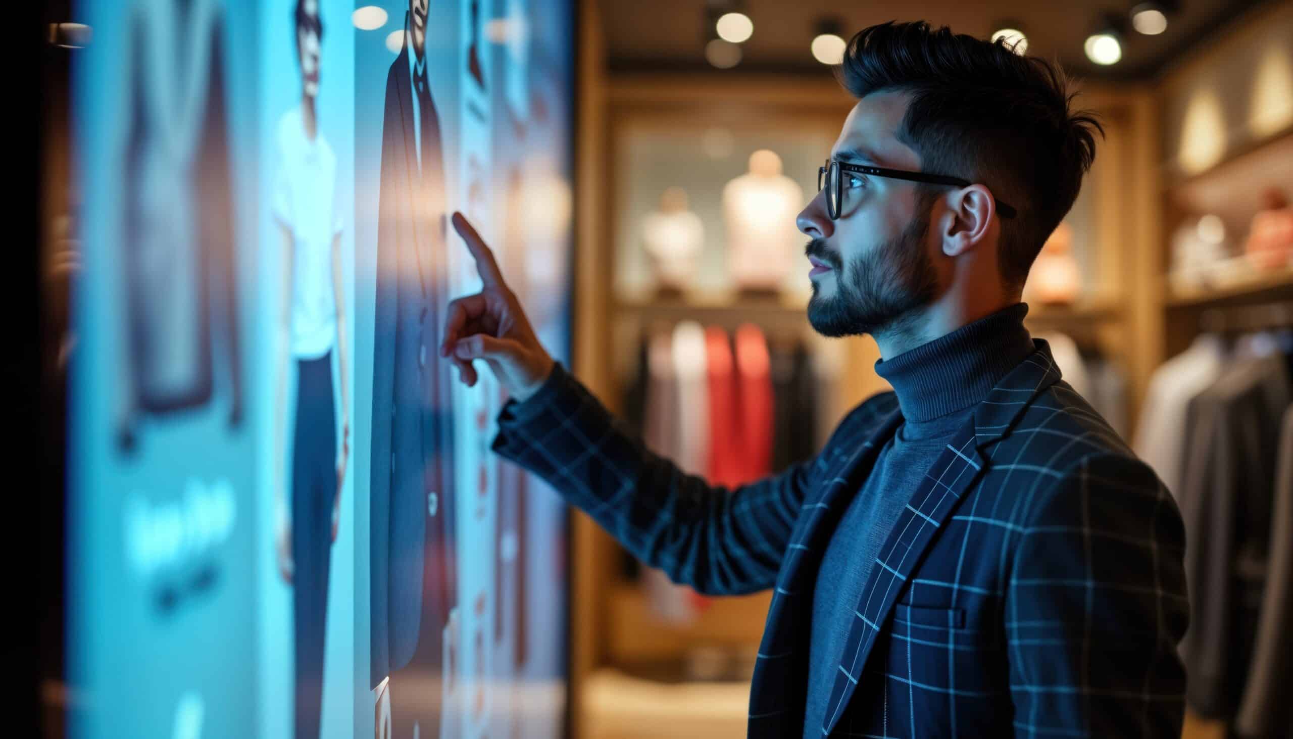
Shoppers now expect digital layers in physical retail space. Their everyday experiences with smartphones and online shopping have reset expectations for how easy and engaging in‑store product discovery should feel.
Interactive displays and digital elements are not gimmicks; when used well, they help customers explore products, compare options, and make decisions with more confidence. The goal is to support the shopping journey, not to add technology for its own sake.
Different types of interactive elements can serve different purposes:
| Element | Function | Best For |
|---|---|---|
| Touchscreens | Product finders, customization tools | Electronics, beauty, apparel |
| Motion sensors | Trigger lighting or content | High-traffic areas, window displays |
| QR codes | Link to videos, reviews, tutorials | Cross-channel engagement |
| Digital signage | Real-time offers, inventory, storytelling | Promotions, brand immersion |
The key is integrating technology thoughtfully. A QR code that opens a clear, helpful how‑to video or a product detail page adds value to the visit. A QR code that sends customers to a generic homepage, or an interactive screen with no clear purpose, creates friction and wastes the opportunity.
FELBRO Studios, for example, can build interactive electronics directly into POP displays, such as integrated LEDs, sensors, and embedded screens within custom fixtures, to make engagement feel seamless and on‑brand. This type of embedded interactivity can be particularly effective for attracting younger, tech‑comfortable shoppers and families who respond well to clear guidance and engaging experiences.
Measuring impact is essential. Track changes in dwell time near the display, how often shoppers interact (touches, scans, or activations), and how those interactions relate to actual sales in the category. Comparing these metrics before and after installation helps clarify whether a given interactive or digital display is delivering a return on investment.
Mistake 8 – Lack of Seasonal or Trend Relevance
Seasonal and trend-based merchandising shows customers you understand what is happening “now.” Whether it is back-to-school in August, a current wellness focus, or a major sporting event, timely displays create relevance and a clear reason to buy today rather than later.
When a store misses key seasonal moments or leaves outdated seasonal displays up long after they make sense, it can signal that the environment is not being actively managed. Shoppers may perceive the space as stale or out of touch, which reduces their motivation to return or explore.
Examples of effective seasonal stories include:
- Summer travel kits in early and mid-summer (sunscreen, travel sizes, travel accessories).
- Giftable sets in November and December (bundled products, premium or ready-to-gift packaging).
- Outdoor living and entertaining displays in late spring (grilling, gardening, patio and hosting items).
- Back-to-school organization and study setups in late summer.
Cultural moments and local events also matter. Festivals, sports seasons, and regional holidays can be turned into focused merchandising stories that make customers feel the store understands their community and daily life.
Limited-time visuals help reinforce the sense that certain offers or assortments are available only for a short period. Examples include:
- Special packaging or “seasonal edition” callouts.
- Unique or exclusive colors or bundles tied to a specific moment.
- Clear countdown or “while supplies last” messaging to indicate that an offer will not be around indefinitely.
FELBRO Studios supports rapid rollout of seasonal programs across many locations by providing pre-kitted, easy-to-install display packages. This helps brands and retailers update stores quickly and consistently, so they can take full advantage of short seasonal and trend windows without overloading local teams.
Mistake 9 – Ignoring Scale and Consistency Across Locations
Brands operating multiple stores, shop-in-shops, or national programs face unique challenges. What works in a flagship doesn’t automatically translate to a mall kiosk or a rural outpost.
When local teams improvise displays, problems multiply:
- Off-brand materials that confuse customers
- Incorrect assembly that diminishes visual impact
- Inconsistent messaging across regions
- Uneven customer experience that damages brand recognition
These inconsistencies do more than just “look messy.” They can dilute brand recognition, make it harder for customers to know what to expect from store to store, and ultimately undermine the value of the brand identity and merchandising strategy that has been developed at headquarters. Clear guidelines, standardized kits, and simple training or rollout tools help ensure that the intended experience is delivered consistently, regardless of location or store format.
Designing for scale from the start:
| Consideration | Solution |
|---|---|
| Fixture variability | Standardized kits of parts that adapt to different footprints |
| Installation complexity | Clear assembly instructions with visual guides |
| Store size differences | Modular designs that work in 800 sq. ft. boutiques and 5,000 sq. ft. flagships |
| Shipping damage | Packaging engineered to survive freight |
| Parts replacement | Labeled components with clear replenishment strategies |
FELBRO Studios has extensive experience rolling out consistent programs for national retailers. Our process includes prototyping, testing in pilot locations, and full-scale deployment with quality controls that ensure the display looks and functions as intended in every store, regardless of format or region.
Mistake 10 – Focusing Solely on Price or Promotion
Discount-driven merchandising trains customers to wait for deals instead of buying based on genuine interest in the product. When every message is about price, the brand’s story, quality, and differentiation get pushed into the background.
There is an important difference between leading with price and leading with value:
| Price-Led Approach | Value-Led Approach |
|---|---|
| Big red “SALE” signs everywhere | Benefits and quality highlighted first |
| Discount percentage as the hero message | Brand story and lifestyle imagery featured |
| Clearance aesthetically pleasing only to bargain hunters | Premium experience that justifies full price |
| Short-term revenue, long-term brand erosion | Sustainable margins and stronger customer loyalty |
This doesn’t mean ignoring promotions entirely. It means reserving heavy promotional language for strategic campaigns while using most visual real estate to elevate the brand and product benefits.
Consider a premium beverage display that spotlights ingredients, sustainability credentials, and lifestyle imagery. The price messaging is there, clear and accessible, but secondary to the story. This approach creates lasting impressions that inspire customers to buy based on perceived value, not just a temporary discount.
FELBRO Studios’ philosophy centers on designing displays that guide customers toward purchase through trust, brand immersion, and perceived value. The best practices we’ve developed over decades consistently show that aesthetically pleasing environments that showcase products thoughtfully outperform walls of sale items and aggressive promotions.
👉Also Read: Beyond the Display: How FELBRO Studios Uses Data and Design to Maximize Retail Performance
Transform Retail Merchandising Into a Scalable Growth Platform
Retail environments succeed when strategy, design, and execution operate as one system. That alignment rarely happens by accident. It requires a partner who understands how design intent translates into real-world manufacturing, logistics, installation, and long-term program management.
FELBRO Studios operates as a single-source partner for brands and retailers seeking high-impact, scalable retail environments. We manage the full lifecycle of a program in-house, from concept development and engineering through fabrication, kitting, fulfillment, and multi-location deployment. With domestic manufacturing capabilities and dedicated offshore production teams, we help organizations maintain quality control while supporting complex national and international rollouts.
Our work is built for longevity and adaptability. Displays are engineered to evolve, support future campaigns, and remain structurally and visually relevant well beyond a single season. This approach reduces operational friction, protects brand standards, and allows internal teams to focus on growth rather than constant rework.
If you are evaluating a new retail initiative, planning a rollout across multiple locations, or reassessing how your physical environment supports your brand, FELBRO Studios is prepared to guide that conversation. To speak directly with our team and explore next steps, contact FELBRO Studios.
Frequently Asked Questions
How often should a retail store update its visual merchandising?
Minor updates, re-merchandising tables, swapping a few key products, and adjusting signage should happen weekly. Campaign or seasonal refreshes should occur every 4-8 weeks, aligned with major retail calendars like back-to-school, holidays, or product launches. Major concept overhauls typically happen 2-4 times per year, though the frequency depends on your category and traffic patterns. High-traffic stores with repeat customers need more frequent refreshes to combat habituation.
What metrics can I use to measure the success of my visual merchandising?
Focus on practical KPIs that tie directly to merchandising changes: conversion rate, average order value, units per transaction, dwell time at key fixtures, and sales lift for featured SKUs before and after display changes. Comparing foot traffic data with conversion rates helps isolate whether changes attract more shoppers or simply convert existing traffic better. For interactive displays, track engagement rates like touch or scan counts.
Do small retailers need professional help, or can they manage merchandising in-house?
Smaller boutiques can often execute effectively with internal teams if they follow the basic principles outlined here—clear focal points, appropriate lighting, consistent branding, and regular refreshes. However, professional consultation becomes valuable when launching new concepts, dealing with complex fixtures, or scaling across multiple locations. Partners like FELBRO Studios also offer modular solutions that give smaller retailers access to professional-grade displays without custom development costs.
How should in-store and online visual merchandising work together?
Physical displays should mirror online campaigns, same hero products, messaging, and visual language, so customers experience a seamless journey from digital discovery to the brick-and-mortar store environment. When a customer sees a product on your website or social media and then encounters consistent visuals in store, it reinforces purchase intent. This is sometimes called online visual merchandising integration, and it’s becoming essential as different types of shoppers move fluidly between channels.
What budget should retailers expect for a custom display program?
Costs vary widely based on materials, technology integration, and scale. A single flagship display with interactive elements costs significantly more than a simple shelf system, and a 500-store rollout involves different economics than a pilot program. Custom fixtures, digital components, and premium materials increase investment but often deliver stronger ROI through better conversion.
